This week we covered the Nasdaq 100 “Bullish Percent” and what it potentially implied for the QQQ moving forward. It has deteriorated from 78 to 75% since we put up the post:
What “Nasdaq 100 Bullish Percent” is saying about the market now…
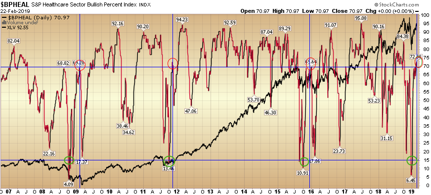
Right now, the “Bullish Percent” Healthcare Sector is coming in at 70.97% (off its recent peak of 72.58%). The above chart is the “Bullish Percent Index” for the Healthcare Sector (red and black line) with the Healthcare Sector ETF (XLV) in the background (all black line).
The Bullish Percent Index, or BPI, is a breadth indicator that shows the percentage of stocks on Point & Figure Buy Signals. There is no ambiguity on P&F charts because a stock is either on a P&F Buy Signal or P&F Sell Signal. The Bullish Percent Index fluctuates between 0% and 100%.
In December, the Bullish Percent for Healthcare got below 15%. Historically, it has paid off big time to buy a dip in this reading below 15.
Here’s what it has done: In each instance where the Healthcare “Bullish Percent” has dropped below 15%, when it rebounded back above 69%, it always dropped back again to at least 50% before resuming higher.
So what does that imply?
It implies we could see a pullback as noted by the 3 previous instances marked by the blue vertical lines. What did the pullback (retest) to the 50% (or lower) Bullish Percent mean to the Healthcare Sector ETF (XLV) in percentage terms the last three times (XLV is the black line in the background of the chart)?
Example 1: From Feb 6, 2009 (when Bullish Percent Healthcare rebounded above 69) to March 6, 2009 (when it retested below 50), the XLV dropped 21.49%
Example 2: From September 1, 2011 (when Bullish Percent Healthcare rebounded above 69) to October 4, 2011 (when it retested below 50), the XLV dropped 10.29%
Example 3: From December 29, 2015 (when Bullish Percent Healthcare rebounded above 69) to February 9, 2016 (when it retested below 50), the XLV dropped 14.32%
A few things to keep in mind:
1. Despite the nasty retest in all three instances, the market ultimately rebounded and made significant new highs. In both 2016 and 2011 it was right away. In 2008 it took longer.
2. This sample is VERY small. The minimum you ever want to consider is 3 instances. This is the minimum and may be statistically insignificant – but worth noting.
3. As with all indicators they are to be used as a barometer, NOT a crystal ball. It is always helpful to have a handful of indicators working in the background so you can measure where you generally are in terms of extremes.
The key is taking probability advantaged trades over a series – with a positive expected outcome – and disciplined risk management and sizing to win over time.
If you found this post helpful, please consider visiting a few of our sponsors who have offers that may be relevant to you.