Last week I put out the article “Double Earnings Drops = Double Trouble”:
Since publishing this, the data has changed. Today we are going to explore the change in data and how it is vying for supremacy with the yield curve inversion thesis. In other words, your classic bull vs. bear death match!
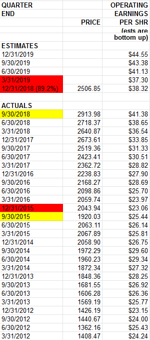
The core change in data came last week when Howard Silverblatt (S&P global) released the newest S&P500 Operating Earnings Data for Q4 2018:

This varies greatly with the data we had in hand just a week ago in our original post:

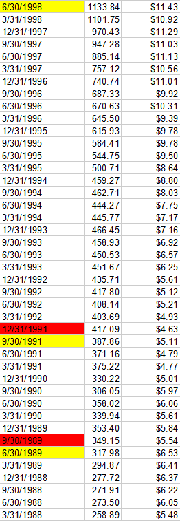
The core difference is that with 89.2% of the S&P having reported originally, the operating earnings he had listed as the estimate were $38.32 for Q4 2018. Now, with 98.6% having reported, they have plummeted to $34.98. Sequentially this change is meaningful as it changed from a 7.39% sequential drop, to a 15.46% sequential drop in operating earnings. We have had 2 other sequential drops in operating earnings of this magnitude: Q2-Q3 2007 was a 13.25% drop and Q4 2000-Q1 2001 was a 18.15% sequential drop. Both instances led to lower lows and a cascading of equity prices. You can see those instances here:


As you will see, in all other instances of sequential earnings drops over the past 30 years, they were for 1 quarter only (in which case you had your market correction of 10-20% and moved on about your business to new highs over time – NO LOWER LOWS).
We are at a critical crossroads now:
The good news is that the drop in Q4 operating earnings now makes Q1 2019 look like it will be positive relative to Q4 2018 – which would fall in line with previous instances of a 10-20% market drop and no lower lows (in other words the pain is behind us as we completed the 20% drop in December). The bad news is, IF Q1 Operating earnings estimates drop $2.15 or more, that would take them from $37.12 ( a positive sequential against Q4 2018) to $34.97 or less which would be the second negative sequential drop.
This only happened in 2007/2008 and 2000/2001 as you can see in the data above. The bigger problem is that if Operating Earnings can fall $3.38 in a couple of weeks like they just did for Q4 2018 reporting, it is very possible they could fall $2.15 or more from here for Q1 2019 operating earnings – which would not necessarily bode well for the market.
So that’s really the bad news.
Here’s the offsetting good news – hence the Bull vs. Bear Death Match:
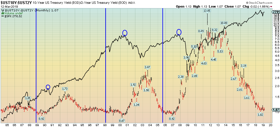
The yield curve (as defined by the 2/10 spread) has not yet inverted. And no, I don’t want to hear about the 3/5yr spread nonsense as that is noise. In the featured chart at the beginning of this article, it shows the three times in the past 30 years that the yield curve has inverted (represented by blue vertical lines): November 1988, February 1998, and September 2005. What is the common denominator?
The stock market ran for ~2 years AFTER the 2/10 inversion BEFORE the stock market peaked (represented by blue circles). We came AWFULLY close to inverting at 1.02 in September of 2018 (below 1.0 is inversion), but we did not invert. Do you want to know the last time we came that close without inverting? December 1994.
In both cases the Fed realized they had moved too fast after 2 years of raises and changed course on the dime. In 1995 Greenspan implemented 3 quick cuts before raising again and extended the cycle by 5 years. In January 2019 Powell did an about face and paused. The question is whether or not he will be as quick as Greenspan was in admitting his error and correcting it. Pausing is not the same as easing – particularly when Quantitative Tightening is still proceeding in the background until the end of the year.
So where does that leave us? The yield curve says we have ample time to run, but earnings are signaling a “make or break” in Q1. The only thing we can do is see how the data comes in and adjust with the facts.
If you found this post helpful, please consider visiting a few of our sponsors who have offers that may be relevant to you.


